Why is battery data visualization important when working with battery data specifically?
Battery data visualizations can instantly bring to life the insights that data tables struggle to express, but only if the charts fit the context. Before we deploy a chart, we always make sure it fits the needs of the use case, and that the needs in turn determine the charting solution we employ.
When monitoring industrial batteries deployed at a site, operating conditions and performance indicators should be similar for all energy blocks on a site, and all strings in a block. If discrepancies occur, you want to investigate immediately. That’s only possible by viewing charts that provide live visualizations at every level of the hierarchy.
It’s often difficult to see potential red flags or anomalies when dealing with large datasets. What strategies can we use to selectively drill down into a vast amount of battery data?
The ability to drill down into the battery data is crucial, not only because trends may be difficult to identify and remedy at a macro level, but also due to the practical limitations of web browsers to present large amounts of data at once. It’s important to be able to drill down at a variety of levels, all of which map to real-life battery configurations. Notice one block is discharging faster than others? You can easily zoom in on that block and see the relevant details instantly. Notice one of the block’s strings is under voltage? Zoom in on that string for a full view of what’s happening. At every level in the battery grid configuration, dynamic charts let you synchronize any number of attributes to the same live timeline, so that discrepancies between subcomponents or correlations between attributes literally jump out at you.
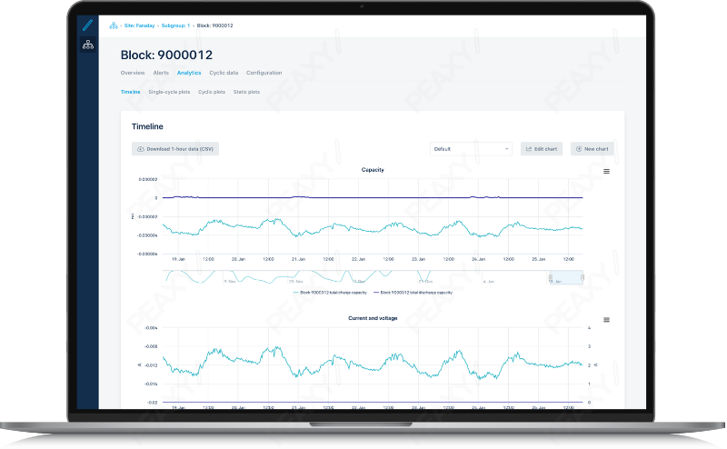
See emerging trends or anomalies in live data with dynamic charts
What are some of the challenges of dealing with historical battery data?
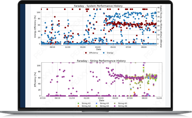
When analyzing historical battery data to satisfy reporting obligations or monitor warranty regimes, millions of granular data points per 24-hour cycle need to be conveyed accurately on a chart, and that’s a big challenge. Conventional decimation techniques can miss brief voltage spikes, so instead we periodically run data pipelines that incorporate every data point, no matter how anomalous or fleeting, into the plot. Since the primary goal is archival accuracy that can meet regulatory obligations, these static charts are pre-rendered daily, once the cycle is completed.
Create automated operational reports on full-screen resolution datasets with static plots
How important is it to allow the end user of the software to define and design their own visualizations? What kind of benefits does that offer?
For modern, cloud-based solutions, you must have the upfront configuration tools that allow you to perform deep analysis without needing to involve a programmer or write a single line of code. For example, before you can train a regression analysis algorithm on historical data to generate performance predictions from live data, it’s important to get a feel for how the various features correlate, so that the dataset can be culled of any superfluous attributes. To this end, our self-service tool PLI Machine Learning Manager employs three complementary point-and-click charting tools:
- A heat map places all features on the grid — both numerical and categorical — to present an overarching view.
- The correlogram zooms in on a user-selected subset of numerical features, constructing confidence ellipses for each combination.
- And finally, a detailed plotter lets the user deep dive into the distribution correlation of up to three features of any type.

Visualize statistical correlations to seed machine learning algorithms
This four minute video walks through some useful examples of how PLI Machine Learning Manager takes advantage of battery data visualizations, in this case to support feature engineering and the seeding of algorithms that are used to power the analytics. Click below to watch.